A new digital home for the Dutch Human Rights Council
Accessibility isn’t the first and sexiest term when you think about redesigning the digital home for The Netherland’s Human Rights Council. But it was a great starting point to rethink how their new website should look, and more importantly, should navigate for people with (reading) disabilities.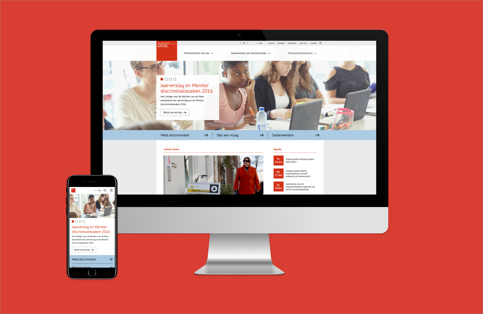
Goal
Create a new digital home for the Dutch Human Rights Council to cater to it’s broad demographic.
Create a new digital home for the Dutch Human Rights Council to cater to it’s broad demographic.
Objectives
- Create user flows and information hierarchy
- Improve overall navigation
- Modernize and implement online brand identity
-
Accessible across all devices for people with (reading) disabilities
Fot it’s 5 year anniversary ‘College voor de rechten van de mens’ wanted to reposition themselves online. In order to achieve this an extensive and detailed process was needed to redefine the council’s brand digitally.
First, an assessment of the current website was needed. In it’s core the old website is a powerhouse of information catering to a multitude of different audiences. The biggest question therein was: ‘How to give all these different groups a relevant experience when visiting the website?’
Data of use, flows, demographics and inside knowledge of the council led to a few core personas and user journeys for the new website. Looking at current users and device use the decision was made to create the website mobile first.

The new website needed a new way of structuring all it’s data. It would use a large amount of ‘Tags’ which can be attached to all kinds of different page types on the website. News items, in depth articles, events, campaign pages and even jurisdiction verdicts were given ‘Tags’ in the CMS. This ensured that content managers could easily create entire bubbles of information that specifically were catered to a certain demographic or topic.
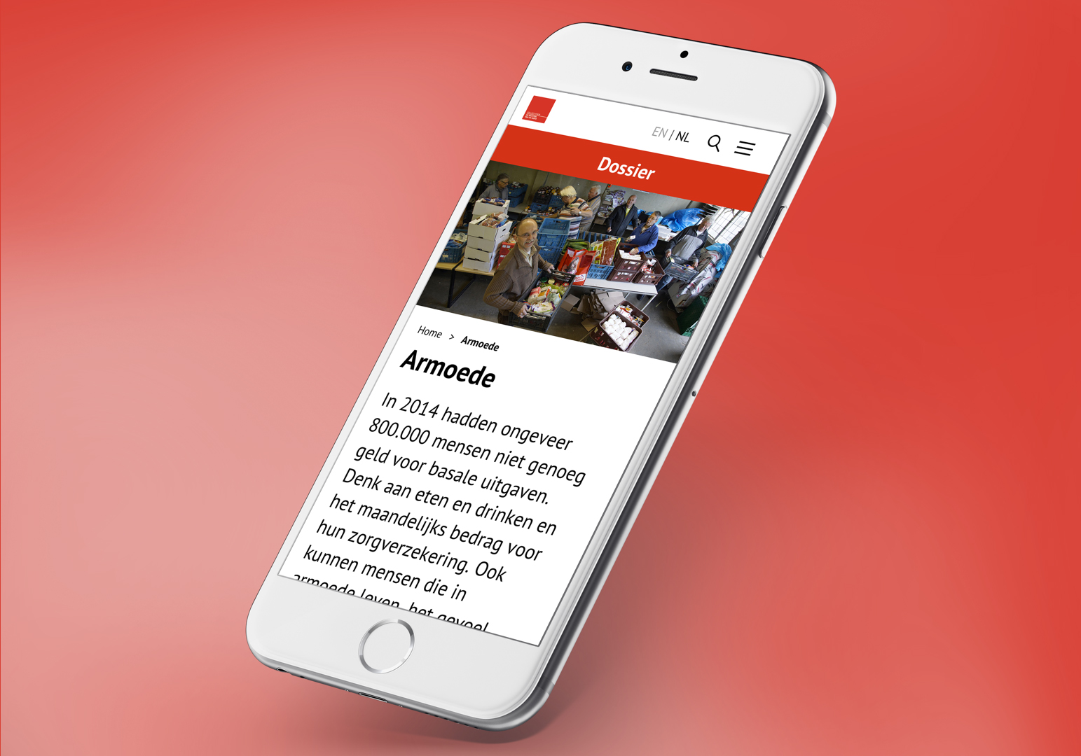
Also, so called ‘subsites’ were introduced. Some of the core users of the website would need a very large amount of information and data. In order to bundle and present this the decision was made to lead the user into a flow to several mini websites within the core website. Here, they could find exactly the kind of information they were looking for and dive deep into the matters.

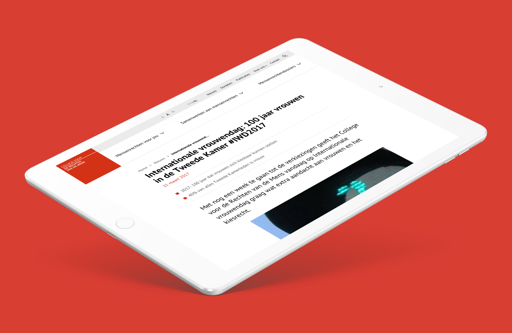
Flows and information structure were definitely important, but also finding the right balance in online brand identity, usability and accessibility. We worked closely with the council and it’s very strict rules on accessibility whilst maintaining a sense of modern esthetics. UX wise the navigation was a major player in the information funneling as also was presenting the right information at first glance.
Call to actions are now more prominent, reading through news items, articles and dossiers is easier and seamless and search functionality is greatly improved.
With the redesign the council got its birthday present in 2018.
Launch ︎
With the redesign the council got its birthday present in 2018.
Launch ︎
Amsterdam - ︎ mootdavid@gmail.com