New ways to browse designer brands on Farfetch
After the redesign of our ‘Designers Hub’ where we introduced the ability to see, navigate to and (un)favourite ‘Designers’ we looked at ways of improving how customers could browse their most beloved brands in our app. Customer insights helped us understand which paths we could take to level up the experience in multiple key touch points in our users’ journeys.
Problems and opportunities
Zooming in on Search
Search is a very popular feature in the Farfetch app. Farfetch has over 1400 designer brands on its marketplace and on any given day a cumulative number of of 400K+ unique pieces are available for purchase. Finding what you’re looking for can be quite daunting. Our search logic was in need of an update so that it could support more ways of helping users find what they are looking for.
- Global Search only displays auto suggestions for ‘Designers’ and ‘Categories’. Leading users to believe the only way to get to a specific search results is to use filter options on product listing pages.
- There is no way of selecting multiple designers from our Designer A-Z which creates a lot of back and forth when a user wants to explore multiple brands at once. This is a particularly apparent issue during sale season.
- No way of filtering a listing page of products by a user’s favourite designers.
Zooming in on Search
Search is a very popular feature in the Farfetch app. Farfetch has over 1400 designer brands on its marketplace and on any given day a cumulative number of of 400K+ unique pieces are available for purchase. Finding what you’re looking for can be quite daunting. Our search logic was in need of an update so that it could support more ways of helping users find what they are looking for.
Search suggestions before (left) and after (right)
The old behaviour only allowed for ‘Designers’ (E.g. ‘Gucci’) and ‘Categories’ (E.g. ‘Coats’) to appear as an auto suggestion when a user is typing. We set out a roadmap to incrementally allow for more types of suggestions to appear that would improve the search experience. First in line was introducing the combination of Designers + Categories + Keywords as suggestions (E.g. ‘Gucci Shoes’ or ‘Balenciaga Triple S’). Using our search query data logs we ranked the suggestions based on popularity in the previous two weeks. This period was defined as to also be able to capture seasonal trends.
The AB test is currently running and results will be shared when they become available. An iteration we are aiming for is to include sales data as a parameter of defining the ranked order of suggestions.
Filtering by Favourites
Allowing users to filter by their favourite designers was next. This feature already proved to be successful when another team tested this on our website with a small group of loyalty programme customers. On the app we knew this had potential to be even more successful as our most highly engaged customers primarily use the app to browse Farfetch. They also have a higher number of favourite designer brands on average.
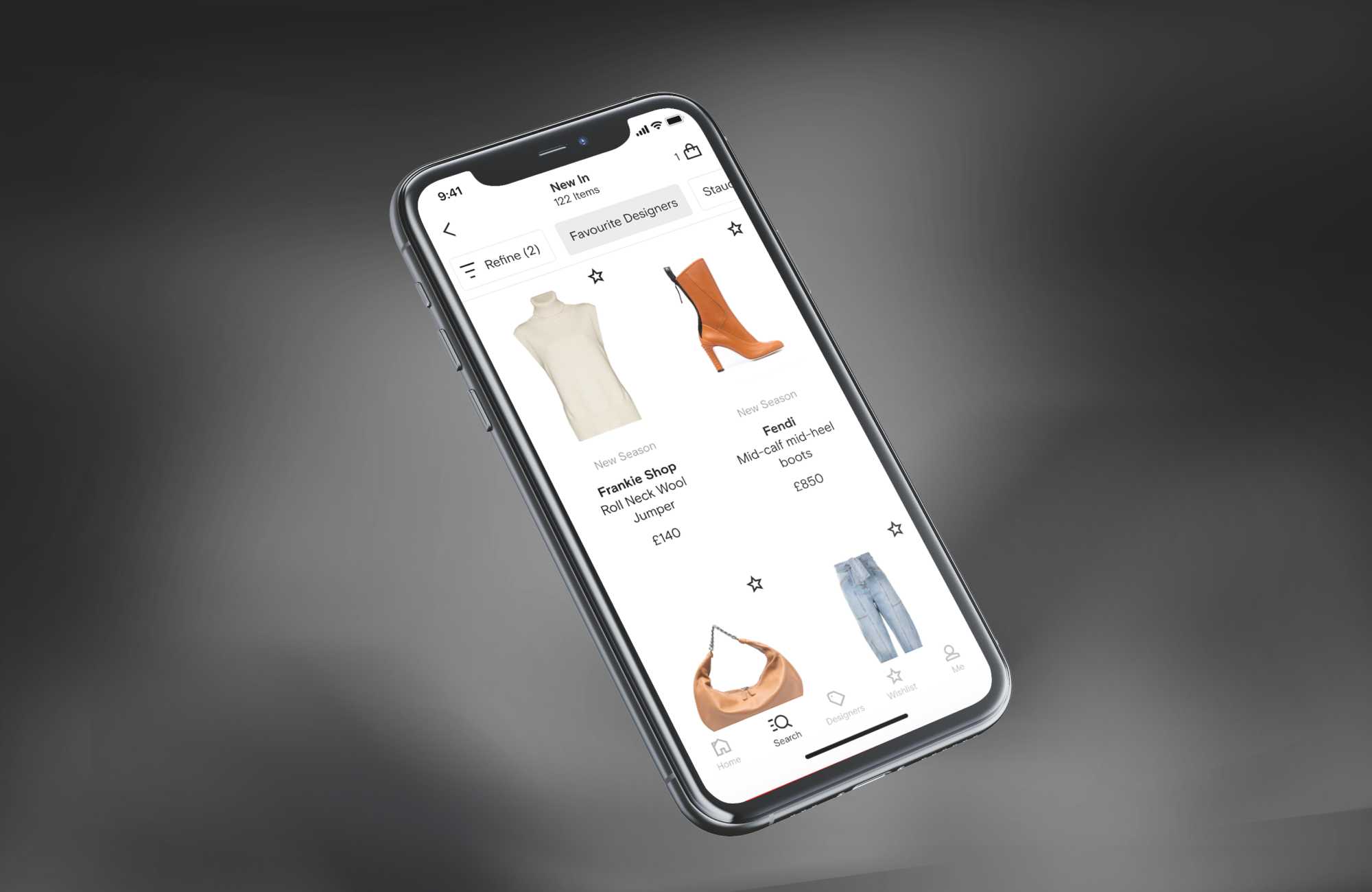
Filtering by Favourite brands
We took advantage of our ‘Quick Filter’ feature where we introduced the option to quickly select the filter on a listing page with a single tap and also implemented it in our ‘Refine’ screen.
The AB test is currently running and results will be shared when they become available. A future iteration could probably include an easier way to see a distinction between all brands and a user’s list of favourite brands in the same list.
The AB test is currently running and results will be shared when they become available. A future iteration could probably include an easier way to see a distinction between all brands and a user’s list of favourite brands in the same list.
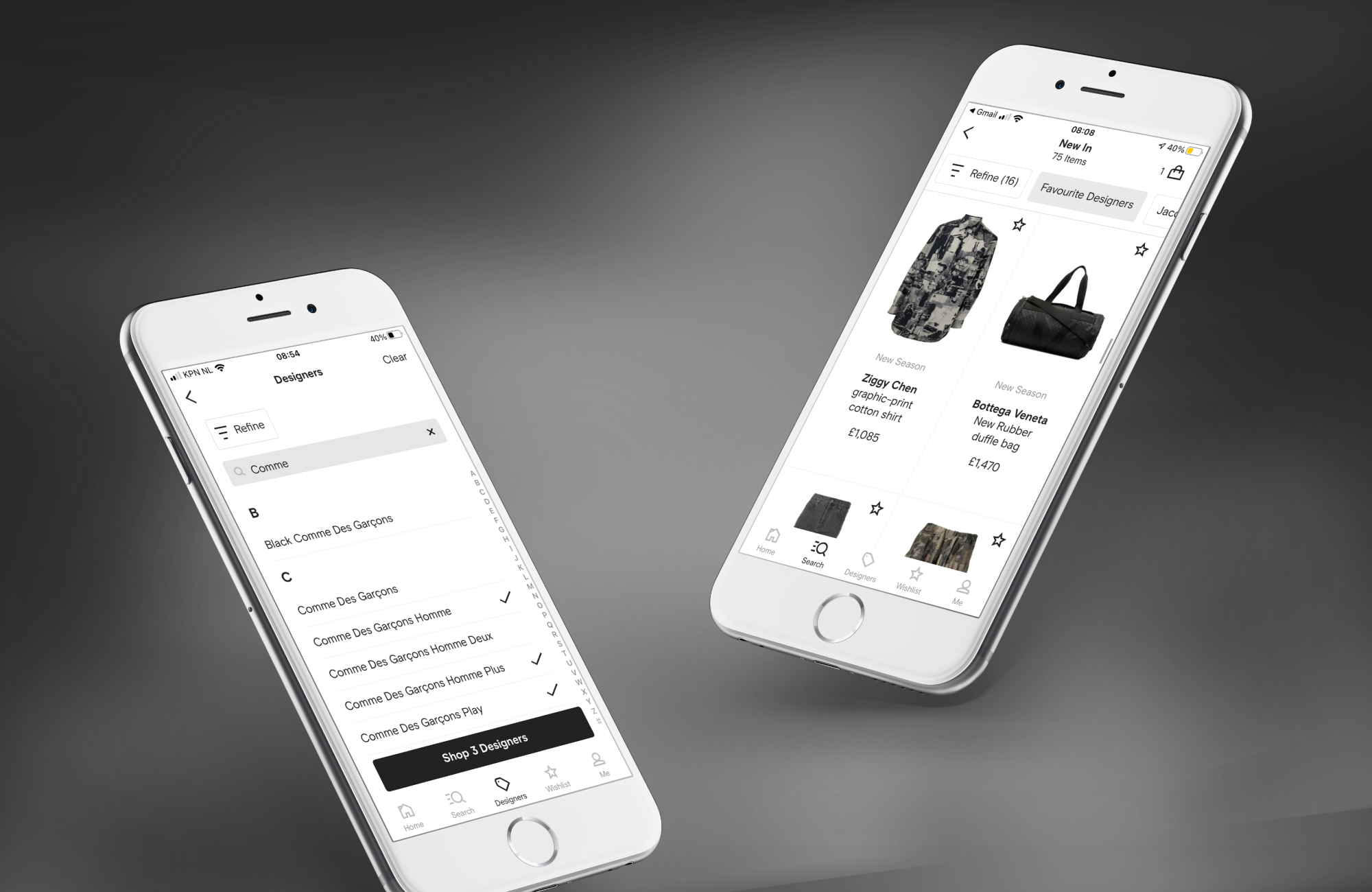
Setting a new standard for Designer A-Z browsing
When researching the competitor landscape we found that almost none of the apps in luxury fashion allow for users to see a listing page of multiple designers of a user’s own choice outside of filtering options. We knew from our own qualitative insights that users desired a feature where they could start their browsing journey with a selection of (favourite) designer brands of their own choosing.
Before (left) and after (right)
Seeing products from multiple brands used to mean a lot of back and forth between a list of all brands and their respective product listing pages. We introduced a pattern where users now can select one or more brands they want to see products from. This pattern is similar to the one used in ‘Refine’ where users could already select multiple designer brands which meant we introduced more parity across the two touch points.
The AB test is currently running and results will be shared when they become available. As a next step we want to even further create parity between the two screens in ‘Designers A-Z’ and ‘Refine’ and improve how users see their favourite brands in these screens.
Reflection
Although the touch points for these three projects mostly sit in different parts of our users’ journeys they all are part of a bigger piece of work around brand navigation across the Farfetch app. What makes it tricky is that multiple teams are involved or oversee the various areas we wanted to introduce improvements. Having a clear strategy on a higher level helped us collaborate on all of the various initiatives and, overall, led us to create a coherent experience across multiple features.Amsterdam - ︎ mootdavid@gmail.com